Color Converter
HEX, RGB, HSL, HSV and CMYK with a live WCAG contrast check and CSS tokens.
This color converter takes any CSS color you paste and returns HEX, RGB, HSL, HSV and CMYK in one pass, so you stop guessing how the same shade is written across formats. It runs a live WCAG contrast check of your text against your background, tells you whether black or white reads best on top, and grades the result against AA and AAA. From there it rolls out tints and shades, suggests complementary, analogous and triadic harmony picks, saves palettes in your browser, and writes copy-ready CSS custom properties under a prefix you choose. Everything runs locally, nothing leaves the page, and a copy-report button hands a teammate a clean summary.
100% in your browser. Nothing you type ever leaves this page.

Color converter, WCAG contrast lab, palette builder and CSS token generator
Three tabs open. One to convert a HEX into HSL, one to check it wouldn't blind anyone, one for the CSS. I got sick of it, so here's the lot in a single box. Paste a color however you write it. Back comes HEX, RGB, HSL, HSV, CMYK, a live contrast check against your background, tints and shades, some harmony picks, and CSS custom properties you can paste straight in. Palettes save right in your browser. And when you're handing off to a teammate (or honestly just second-guessing yourself at 11pm), the copy-report button spits out something clean.
Accepted inputs: #0f766e, 0f766e, rgb(15 118 110), rgb(15,118,110), hsl(176 77% 26%) and hsl(176,77%,26%). Contrast is calculated with WCAG relative luminance.
A color converter should help you decide, not only translate values
This color converter does more than swap formats: knowing that #0f766e is also hsl(176 77% 26%) tells you basically nothing about whether you should use it. The question I'm actually chewing on is different. Will this still read once it's a button, or shrunk to a caption on some dark card nobody asked for? A plain converter just leaves you there. I wanted the one that hands over the exact CSS, calls the contrast, and shows me the colors sitting next to it before I commit a single line to a stylesheet.
And that's the job here. Feed it any of the usual CSS color formats. Out comes HEX, RGB, HSL, HSV, CMYK, then it runs the contrast against whatever background you handed it and tells you whether black or white text wins up top. It rolls out tints and shades. Throws some complementary and analogous picks your way. Remembers palettes between visits, and writes the CSS custom properties so you drop them straight into your sheet or a design note, no retyping.
How to read the contrast result
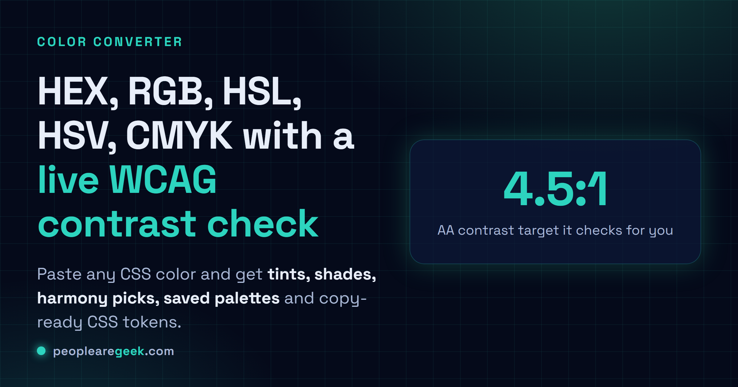
Under the hood it's comparing how bright two colors are against each other, nothing fancier. Body text wants 4.5:1 to clear AA, 7:1 for AAA. Large text gets a pass at 3:1. And maybe it's just me, but I think that 3:1 loophole gets abused constantly. I've watched it wave through pale grey labels and thread-thin nav links nobody over forty can read. So don't test your brand color floating in a vacuum. Test it at the size and weight it'll actually ship at, on the background it'll actually sit on.
- AA normal text wants 4.5:1 or better. That's the bar I hold most copy to, no exceptions I can defend.
- AA large text scrapes by at 3:1. Fine for a heading. Not a license to shrink the body.
- AAA normal text needs 7:1, which is worth reaching for on anything people actually read at length.
- Focus states have to stand on their own. Don't lean on hue, because plenty of folks just won't catch the shift.
- Token names should say what the color does, not what it looks like. Future you, six months out, will be grateful.
Common color debugging examples
Brand color failing on white? You've got moves. Darken it a notch. Or flip it, make it the background, white text on top. Or just retire the poor thing to borders and icons, where contrast barely matters. When every shade blurs into the next, nudge the lightness and leave saturation where it is. That's nearly always the fix. A palette that feels dead usually just needs a few quiet neutrals to lean on, with the loud hues held back for actions and alerts. And charts, please, don't let color carry the whole message on its own. Back it up with a label or a shape. Anyone colorblind in the room will thank you, and so will the next person who prints the thing in grayscale.
Frequently asked questions
Is HEX more accurate than RGB or HSL?
Nope. Common myth, though. They're three ways of writing the very same sRGB color, and the same pixels land on screen either way. I grab HSL when I want to fiddle with lightness by hand, HEX or RGB when I'm dropping values into CSS. Whichever makes the edit less annoying, use that.
Does a contrast ratio guarantee good design?
Not even close. It's a floor, not a finish line. Clearing 4.5:1 means the text is legible. That's it. Font size, line spacing, the hover state, whatever else is crowding it on the page, all of that still decides whether the thing reads well or just technically passes.
Are generated palettes production ready?
Treat them as a strong first draft. They'll carry you most of the way there, but I wouldn't lock them in as final tokens without dropping them into real buttons and cards first. A color looks like one thing in a tidy swatch grid and something else entirely on an actual screen.
How do I convert a HEX color to RGB?
Chop the six digits into three pairs, then read each pair as a base-16 number. So 0f becomes 15. You really don't have to do that by hand, though. Paste the color above and the RGB, HSL and alpha all land right away.
What is the difference between HSL and RGB?
RGB mixes light: how much red, green and blue you stack up. HSL talks in hue, saturation and lightness instead, which honestly maps a lot closer to how my brain works. 'Same color, just lighter' is one number in HSL. In RGB it's a guessing game.