OG Image Preview Studio
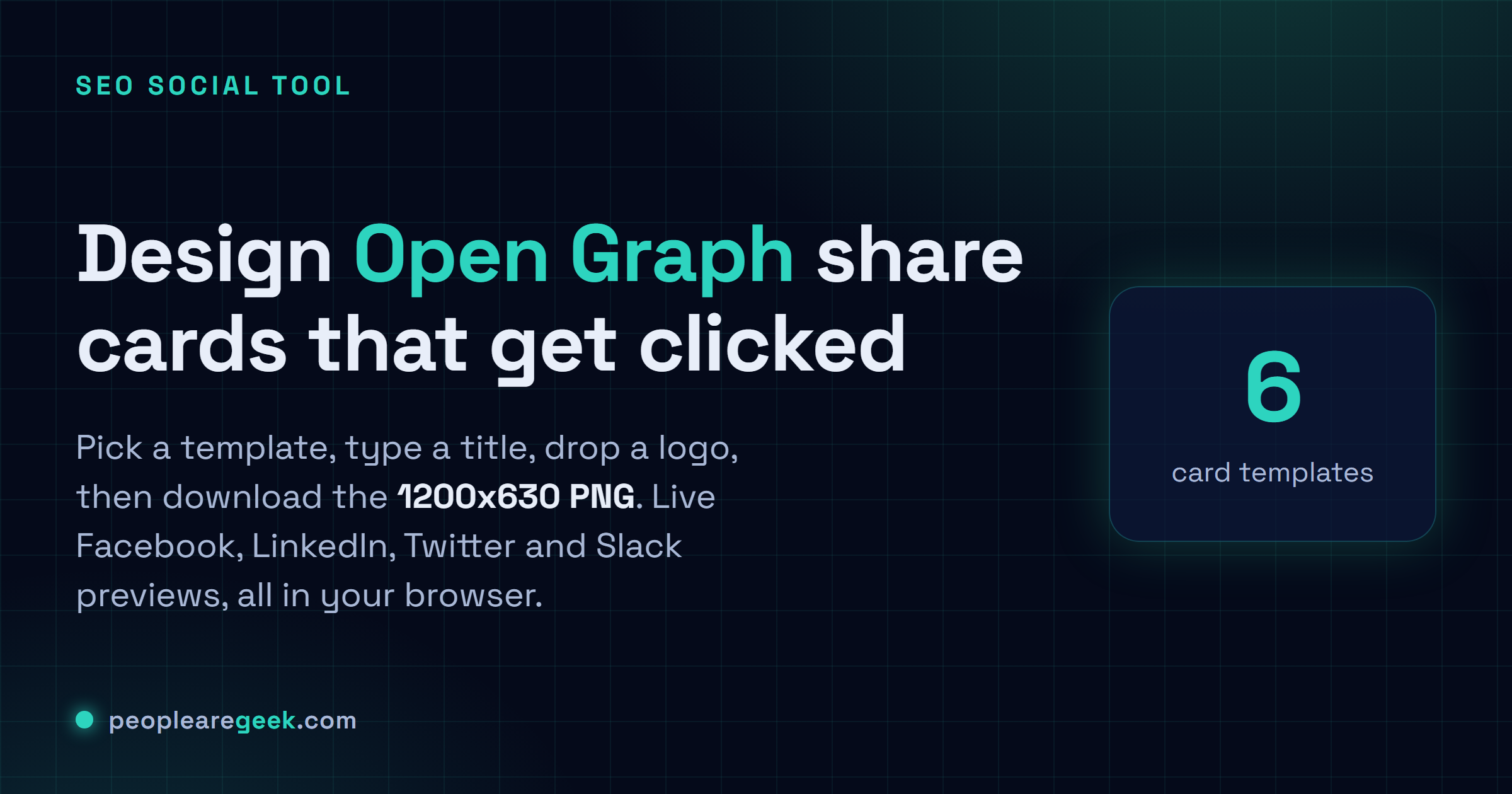
Design and download Open Graph share-card images (1200x630 PNG) in your browser, with six templates and live Facebook, LinkedIn, Twitter and Slack previews.
This OG image preview studio builds the 1200x630 share card your link needs, then shows it landing in real Facebook, LinkedIn, Twitter and Slack previews before you ever publish. Pick one of six templates, type a title and subtitle, set the domain, drop a logo, and nudge the background, accent and text colours until the card reads cleanly. The preview renders at full resolution, so the PNG you download is byte-for-byte what the platforms fetch. A contrast meter flags a low-readability title, a checks tab catches headlines that run too long, and the meta tags tab hands you the og:image and twitter:image markup to paste. Everything draws on an HTML5 Canvas in your browser, so the logo and design never upload anywhere.
100% in your browser. Nothing you type ever leaves this page.

Open Graph image generator
I got tired of shipping links that unfurled as a sad grey box on Slack. So I built this. Pick a template, type your title and subtitle, set the domain, drop a logo, nudge the colours, and watch it land in the Facebook, LinkedIn, Twitter and Slack previews sitting right next to it. Looks right? Download the 1200x630 PNG, done. Nothing uploads anywhere. You don't sign in for anything. The whole thing draws on an HTML5 Canvas inside your own browser, which honestly still feels like a bit of a cheat code.
Live preview at full 1200x630 resolution. The PNG download has the exact same content.
What an Open Graph image actually does for a shared link
Open Graph (OG) is the little protocol that decides what your link looks like the second someone drops it into Facebook, LinkedIn, Slack, Discord, or basically any preview service worth caring about. And of everything on that card, the image carries the weight. A crisp, on-brand picture with the headline baked into it will out-click a bare link or your sad default favicon, pretty much every time. Get it wrong, or forget it, and the card lands as a blank grey rectangle nobody touches. Twitter and X just pull the same file through the twitter:image tag. So one 1200x630 PNG quietly covers the whole mainstream lineup.
That's what this builds: the image, right here in your browser. Pick a template, fill the title and subtitle, drop a logo, dial in the colours and the font, save the PNG. The preview renders at the real 1200x630, so what you're staring at on screen is byte-for-byte what the platforms go fetch. Nothing lost in translation. And those mock cards further down? They fake the Facebook, LinkedIn, Twitter and Slack look so you can catch a low-contrast title, or a headline running too long, before the thing ever goes public.
How the OG image builder works
It's all HTML5 Canvas and a few hundred lines of plain JavaScript. No framework. No build step. Touch any field and the script wipes the 1200x630 canvas, repaints the background (solid, gradient, or a textured layer, depending on the template), then lays down the eyebrow, title, subtitle, domain and logo, wrapping and aligning each block as it goes. The logo gets read locally through the browser's FileReader API and painted with drawImage, so that file never leaves your laptop. Hit download and the canvas goes to canvas.toBlob, which encodes a PNG and pops the save dialog. The preview cards? Just HTML and CSS pointed at the same image data URI the canvas spits out. That's why they redraw the instant you type.
- Pick a template: think of each as a preset, its own heading style and accent placement, tuned for a particular kind of page. Brand pages. Articles. Products. Pull-quotes. Gradient heroes. Plus a stripped-back text-only card for when you just want the words to land and nothing else.
- Type the title and subtitle: the canvas wraps your text for you, keeps a safe margin off the edges (platforms love to shave a few pixels), and shrinks things down when the headline gets greedy.
- Adjust the palette: color pickers for background, accent, text, muted text, the whole lot. The contrast meter over in "Best-practice checks" will yell at you the moment the title gets hard to read, which I find weirdly satisfying.
- Drop the logo: it sits at a fixed size up in the corner. Hand it a square or wide logo on a transparent background and it behaves. Anything weird-shaped, less so.
- Download and publish: grab the 1200x630 PNG, park it at a URL that won't move, then paste the
og:imagetag from the Meta tags tab onto whichever page should claim it.
Common use cases for an OG image studio
- Blog post hero card. One card per article, title baked right in. You don't need a designer on staff to ship share cards that actually look like they belong together. It's a few seconds a post.
- SaaS landing page. A brand card for the homepage, an article card for the blog, a product card per feature. Same look across the lot, and nobody had to brief an agency for every single variant.
- Documentation site. Spin up a card per docs section with the section name as the headline. It beats the auto-generated screenshot most docs sites still ship. Those things are nearly unreadable at preview size, honestly.
- Press release. A quote-style card with one sharp line. In my experience these pull better than a photo card on the B2B feeds, where everyone's already scrolling past stock imagery on autopilot. Could just be the accounts I follow, though.
- Personal portfolio or newsletter. One branded card, your accent color and logo, reused on every link you share. Set it once. Stop thinking about it.
- One-off campaign. Need a card for a single push and don't feel like booting up Figma? Make it here. The pixels come out exactly as sharp as a design tool would give you.
Limitations and privacy notes
Let me be upfront about what it won't do. You get a static PNG. No animation, no embedded video, and no automatic A/B testing across a dozen variants. The logo lands wherever the template puts it, at the size the template wants, so a really wide or really tall logo can sit a bit awkwardly. A transparent square version usually sorts that out. And because Canvas leans on your browser's font fallback chain, a typeface you don't have installed locally just gets swapped for whatever's closest. Need your exact brand font down to the curve? Host a webfont, or render the image on a server that has the font. For a quick preview, honestly, the system defaults are fine for most teams.
The privacy part is the easy part. It all stays on your machine. Title, subtitle, logo, the PNG you download: none of it goes anywhere. No upload. No analytics watching what you design. No third-party call sneaking out the back. So go ahead, mock up the unreleased product page or the embargoed campaign right here. Nobody's seeing it but you.
Frequently asked questions
What size should an OG image be?
1200 by 630 pixels. That's the number everyone settled on, and Facebook, LinkedIn, Twitter, Slack and Discord all render it cleanly. The ratio lands around 1.91:1. Go smaller and it gets scaled up and turns mushy. Go bigger and some clients will crop it on you. Just hit 1200x630 and stop worrying about it.
Why does my new image not show when I share the link?
Caching, almost always. These platforms hold onto your old preview hard, and a fresh image won't show until you force them to look again. After you publish, paste the link into the Facebook Sharing Debugger and the LinkedIn Post Inspector and force the re-scrape. That clears it on the spot. Twitter and Slack tend to sort themselves out within a few hours, so those you can mostly just leave alone.
Should I generate one OG image per page or use a single one for the whole site?
Per page wins on clicks, no contest. My rule of thumb: fall back to one shared brand card on the thin pages that don't deserve their own art, but give every article and every landing page its own card with the real headline on it. You can do both right here, and they'll still look like they came from the same place. That's kind of the whole point.
Where should I host the generated PNG?
Anywhere that's stable and hands back an absolute HTTPS URL. Your CDN, your media folder, an object store like S3, your CMS uploads directory, any of those is fine. The one hard rule: the og:image tag has to point at the full absolute URL. A relative path just quietly fails, and you won't notice until the card comes up blank.