WCAG Color Contrast Checker
Check any foreground and background pair for AA and AAA contrast, with a live preview and a passing-shade fixer, all in your browser.
This WCAG color contrast checker works out the real contrast ratio between any foreground and background pair right in your browser, using the exact relative-luminance math from WCAG 2.x, so nothing you type ever leaves the page. Type a hex value or use the color pickers, and it tells you straight away whether the pair clears AA and AAA for normal text, large text, and UI components, with plain pass or fail badges. A live preview swatch updates as you go, so you can see what a 3:1 ratio looks like next to a 7:1 one. When a pairing fails, one button nudges the lighter color lightness step by step until it just scrapes past AA, keeping your hue and saturation so the fix only trades the brightness it has to. Swap the colors, roll a random pair, or copy the full result for your notes.
100% in your browser. Nothing you type ever leaves this page.

How the contrast ratio actually gets computed
This WCAG color contrast checker is not inventing some vibe. Contrast ratio is a fixed calculation from WCAG. You take each color, convert the red, green and blue channels from 0-255 down to 0-1, then linearize them (sRGB stores brightness on a curve, so you have to undo that curve before any of the math means anything). Then you weight the three channels, heavily toward green because that is roughly how the human eye works, and add them up into a single relative luminance number. Two luminances, lighter one on top, plug into (L1 + 0.05) / (L2 + 0.05), and out pops a ratio somewhere between 1:1 and 21:1.
White on white is 1:1, useless. Black on white is the full 21:1. Everything you care about sits in between, and the thresholds are where it gets practical. The 0.05 in there is a small constant for ambient screen flare, so pure black against pure white never blows up to infinity. You do not need to memorize any of this, the tool does it. But it helps to know the number is real and reproducible, not a guess.
AA versus AAA, and the large-text exception
WCAG sets two conformance levels and they are not interchangeable. AA is the one almost everyone targets, and it is what most accessibility laws actually reference. AAA is stricter, sometimes impractically so for a whole site, but worth hitting on body copy when you can.
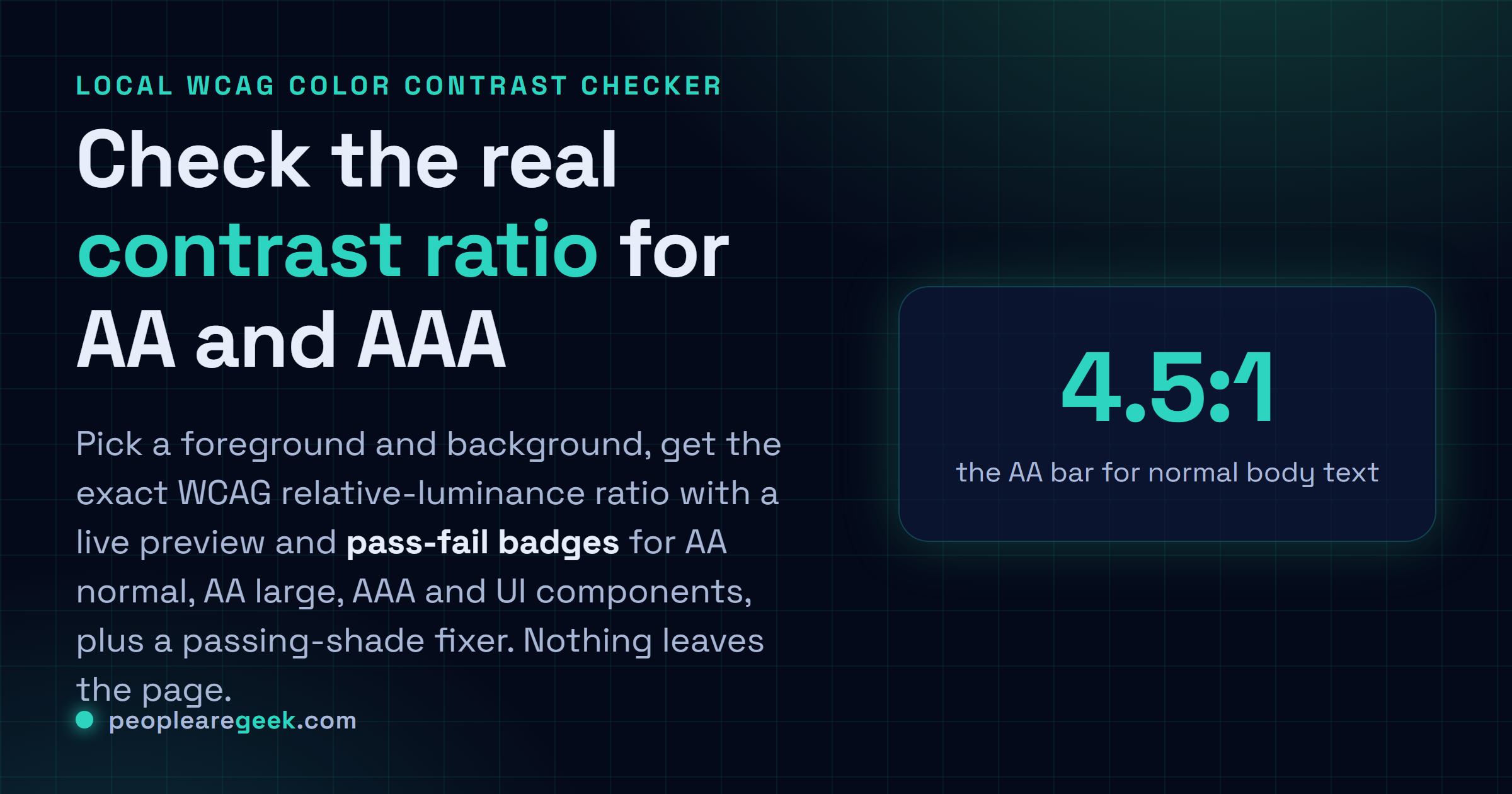
- AA normal text needs at least 4.5:1. This is the bar your paragraphs and labels have to clear.
- AA large text drops to 3:1, because bigger letters are easier to read at lower contrast. Large means roughly 24px (or 18.66px if bold), give or take.
- AAA normal text wants 7:1. Lovely if you reach it. Hard to hold across a real design.
- AAA large text needs 4.5:1, the same number AA asks of normal text.
- UI components and graphics need 3:1 against what is next to them. That covers input borders, icons, focus rings, chart lines, the bits that are not running text.
Common mistakes I keep seeing
Light gray placeholder text on white is the classic. It looks elegant in the mockup and fails AA the second a real person on a real laptop tries to read it outdoors. Another one: testing only your default state and forgetting hover, focus, disabled, and the contrast of the text sitting on a colored button. People also test against the wrong background, the actual page color rather than the swatch behind the text, so the number they trust is fiction. And placeholder text is not a label. Do not let a 2.8:1 placeholder stand in for an accessible field label, because the moment someone types, the hint is gone.
One more, and it trips up everybody at least once: this ratio is about luminance, not hue. Two colors can look wildly different to you and still flunk, especially red against green or other equal-brightness pairs. That is also why a contrast check is necessary but not sufficient for color-blind users. Passing 4.5:1 does not mean you should encode meaning in color alone.
Why contrast matters for accessibility and, yes, SEO
Start with the obvious: people with low vision, aging eyes, or a cheap screen in direct sun all read your site better when the contrast is honest. That is a big slice of every audience, not an edge case. Meet AA and you have cleared a legal bar in a lot of places too, which is its own reason to care.
The SEO angle is more indirect, and I would be lying if I said contrast was a direct ranking signal, it is not. But readable text keeps people on the page instead of bouncing, and Google page-experience thinking leans on real usability. Tools like Lighthouse literally run an accessibility audit that flags contrast failures, and that report is what a lot of teams use to judge a page quality. So a site that reads well tends to do better on the soft signals that actually move rankings: time on page, return visits, fewer frustrated back-button taps. Fixing contrast is cheap. The payoff shows up in places you will not always trace back to it.
Frequently asked questions
What contrast ratio do I actually need?
4.5:1 for normal body text is the number to burn into memory. That is AA, and it covers most of what you write. Headings and other large text can drop to 3:1. If you are going for AAA, push body copy to 7:1. When in doubt, aim for 4.5:1 and you will rarely be wrong.
Is 4.5:1 enough, or should I chase 7:1?
4.5:1 is genuinely fine for most sites and it is what the law usually asks. 7:1 is better for readability, no argument, but holding AAA across an entire design gets painful fast, especially with brand colors. My honest take: nail AA everywhere, then reach for AAA on long-form body text where it costs you little.
Does the contrast checker send my colors anywhere?
No. The whole calculation runs in your browser with plain JavaScript. I never see the colors you pick, nothing gets posted to a server. You could pull your network cable and this would still work.
Why does my color look fine but still fail?
Because the ratio measures luminance, not how different the colors feel to you. Two colors with similar brightness can clash hard visually and still flunk the math. Red and green are the usual culprits. Trust the number over your gut here, your gut was not built for this.
What counts as large text under WCAG?
Roughly 24px and up for regular weight, or about 18.66px and up if it is bold. At that size the threshold relaxes to 3:1 for AA, since larger shapes stay legible at lower contrast. Below that, treat it as normal text and hold the 4.5:1 line.
How does the suggest-a-shade button work?
It takes the lighter of your two colors and walks its lightness in small steps, recomputing the real ratio each time, until the pair clears 4.5:1 (AA normal). Your hue and saturation stay put, so the fix keeps your color character and only trades the brightness it has to. If even pure black or white cannot get there, it will tell you instead of pretending.