Image optimization is the fastest win on almost every site I profile, because images are usually the fattest thing on the page and the hero is usually the Largest Contentful Paint element that decides how fast the whole thing feels. Get delivery right and you shed megabytes off the page while your Core Web Vitals climb and your bandwidth bill quietly drops, and you never touch a line of app logic to pull it off. Here is how I do it in 2026. The formats that actually win. How to send the right size to every screen, and how to wire the whole thing up once so it stops sliding backwards the second you stop watching it.
The short answer
Serve a modern format first (AVIF, then WebP, then a JPEG fallback through
<picture>), hand the browser a four-width responsive srcset, lazy-load
everything except the hero, compress to the lowest quality you cannot see, and
pin width and height on every tag. The five levers multiply, so a
multi-megabyte page routinely drops to a few hundred kilobytes.
Images. On almost every site I've profiled, they're the fattest thing on the page, and the hero is usually the Largest Contentful Paint element that decides how fast the whole thing feels. So that's where I start, every time. Get delivery right and you shed megabytes off the page while your Core Web Vitals climb and your bandwidth bill quietly drops, and you never have to touch a line of app logic to pull it off. Here's how I do it in 2026. The formats that actually win. How to send the right size to every screen, and how to wire the whole thing up once so it stops sliding backwards the second you stop watching it.
Why image weight is the win worth chasing
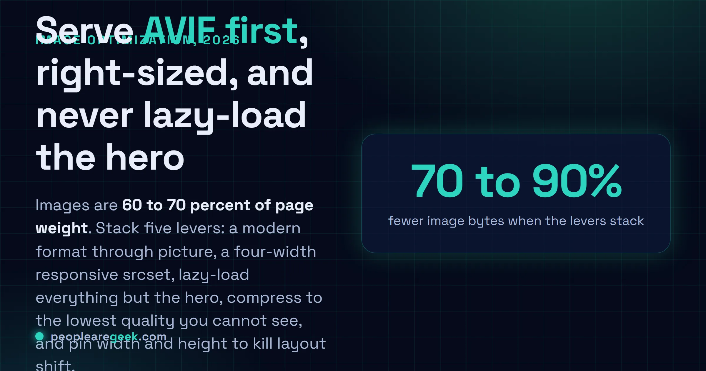
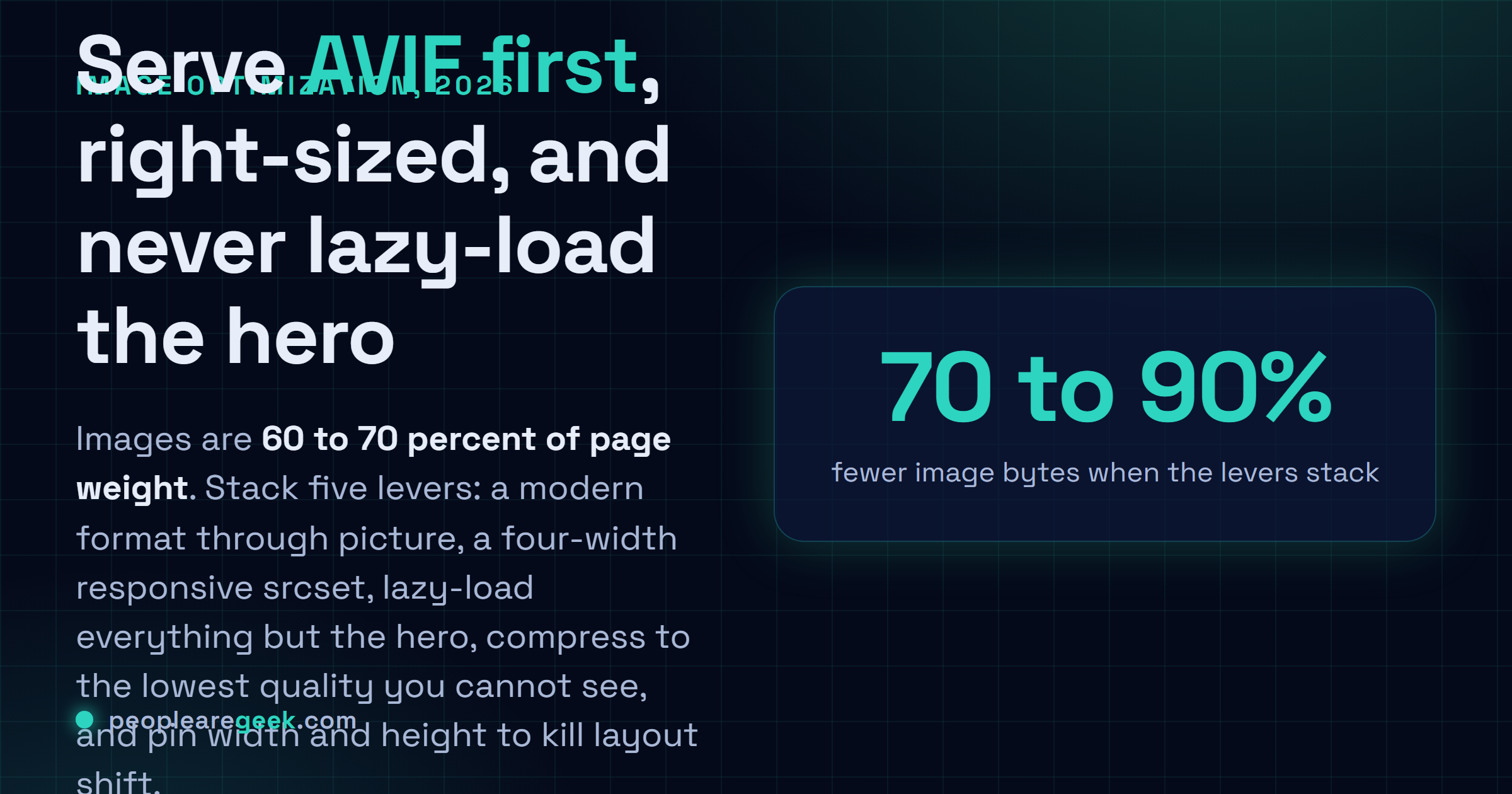
Pop open the network panel on basically any content site and watch images eat the byte count. 60 to 70% of the page. Every single time. And your users feel that weight twice over: in how long the main image takes to show up (that's LCP, which Google wants under 2.5 seconds), and in how much of their mobile plan you just spent on their behalf without asking. A 1.9 MB hero that should've shipped as a 180 KB AVIF isn't some rounding error you can wave off. On a mid-range phone over a normal connection, it's the difference between a page that feels instant and one you sit there watching assemble itself, piece by piece, while the visitor's thumb is already drifting toward the back button.
And here's the part I genuinely like. Image work is mostly mechanical. JavaScript performance? That's profiling and head-scratching and refactoring you'd honestly rather not do on a Tuesday. Images are a pipeline you build once and then mostly forget. The five levers below stack on top of each other, too. A modern format on a right-sized, lazily loaded, well-compressed image served off a CDN can land at maybe a tenth of the bytes the lazy version would've cost you. A tenth. Nobody believes that one until they watch it happen in DevTools.
Choose the right format first
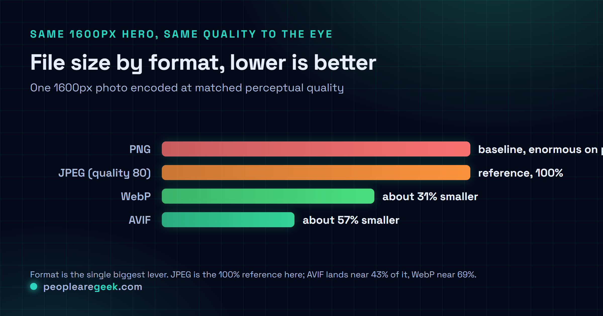
This is the call that pays off most. A better codec saves you bytes at every quality level, not only at the top end where you'd expect it. In 2026 I don't really agonize over this one anymore. The order's pretty settled by now, or settled enough.
| Format | Use it for | Notes |
|---|---|---|
| AVIF | Photos, hero images, anything large | Best compression by far; slower to encode. Supported in all current browsers. |
| WebP | Photos and graphics, universal fallback | ~30% smaller than JPEG, fast to encode, supported everywhere relevant. |
| JPEG | Final fallback for ancient clients | Still fine at quality 75 to 82; use MozJPEG for a free 10% saving. |
| PNG | Logos, screenshots, anything needing crisp edges or transparency | Never use it for photographs; it is lossless and enormous on them. |
| SVG | Icons, logos, diagrams | Vector, tiny, infinitely scalable. Minify with SVGO and inline the critical ones. |

You don't have to crown a single winner and throw the rest out, though. The <picture> element hands the choice straight to the browser. It grabs the best format it can actually read, then falls back on its own without any help from you:
<picture>
  <source srcset="hero.avif" type="image/avif">
  <source srcset="hero.webp" type="image/webp">
  <img src="hero.jpg" alt="..." width="1600" height="900">
</picture>
It reads top to bottom and takes the first type it understands, full stop. AVIF-capable clients get AVIF. Everyone else drops to WebP, and the genuinely ancient stuff lands on the JPEG sitting in the <img>. One thing I'll nag you about until it sticks: never strip that final <img>, and keep its alt, width and height right where they are. That tag is the floor the whole thing stands on.
Serve a size that fits the screen
Right behind wrong format comes wrong size. I see it constantly. A 2560px image fired straight at a 390px phone, which dutifully downloads every last pixel and then shrinks the thing down in the browser anyway. You paid for all of it. You threw most of it away. Responsive images fix exactly this. You hand the browser a few widths and let it pick the right one based on the viewport and the device pixel ratio:
<img
  src="hero-800.jpg"
  srcset="hero-400.jpg 400w, hero-800.jpg 800w, hero-1600.jpg 1600w"
  sizes="(max-width: 600px) 100vw, 800px"
  alt="..." width="1600" height="900" loading="lazy">
srcset is your list of candidate files, each one tagged with its real pixel width. sizes tells the browser how wide the image will actually render, so it can decide before layout even happens. Don't export these by hand. Life's genuinely too short for that. Generate them instead (automation's coming up below). My default set is 400, 800, 1200 and 1600px, which covers phones right up through retina laptops. I only bolt on a 2400px step when I actually have big displays to feed, and honestly most sites just don't.
Load the right images at the right time
Every byte you defer is a byte that isn't blocking your first paint. And here's the nice surprise: you don't need a lazy-load library for any of this anymore, not one. A handful of native attributes carry the whole load on their own.
- Lazy-load below the fold: slap
loading="lazy"on anything that isn't on screen at first render. The browser then leaves it alone until the user scrolls near it. Basically a free win. - Never lazy-load the LCP image: the hero has to load now. Not in a second, now. Leave it
loading="eager"and addfetchpriority="high"so the browser grabs it ahead of the less urgent stuff. I've watched people skip this and quietly wreck their own LCP without ever realizing what they did. - Preload the hero: for that one image that matters most, a
<link rel="preload" as="image">up in the head, withimagesrcsetmatching your responsive set, kicks the download off during HTML parsing. In my testing it moves LCP, and I mean every time I've tried it.
The classic mistake: someone reads "lazy-load your images," does it to absolutely everything, hero included, then watches their LCP score sink. They optimized themselves backwards. Lazy-load the rest of the page, sure. But the one image people actually see first? Give it the priority it deserves.
Compress without visible loss
Format and size sorted, quality is the last knob left to turn. You're hunting for the lowest quality where you still can't spot the difference at normal viewing distance, and that lands around quality 75 to 82 for WebP and JPEG. For AVIF it's lower, somewhere near 50 to 60, because its scale bites harder than the number lets on. Don't read AVIF's 55 as JPEG's 55. They're not remotely the same animal. Here are the free tools I actually keep within reach:
- Squoosh (squoosh.app) for when I just want to eyeball one image right in the browser, watching the size tick live as I drag the slider.
- sharp, the Node library sitting under most build pipelines, whenever I'm batching a pile of them.
- cwebp and avifenc down on the command line when I'm scripting the thing.
- ImageMagick or MozJPEG for those days when something drags me back into JPEG against my will.
# Batch a folder of photos to WebP and AVIF
for f in *.jpg; do
  cwebp -q 80 "$f" -o "${f%.jpg}.webp"
  avifenc --min 24 --max 30 -a end-usage=q "$f" "${f%.jpg}.avif"
done
And strip the metadata while you're already in there. EXIF, colour profiles you'll never once use, the odd embedded thumbnail. That junk quietly tacks on tens of kilobytes per image. Most encoders drop it by default these days, but I never just assume they did. Check with identify -verbose or an online inspector before you trust it.
Automate it, at build time or on the CDN
Manual optimization always rots. Always. You do the work, the scores look great, and then three weeks later someone drops a 4 MB phone photo straight into the CMS and your numbers slide without so much as a peep. So I automate it. There are two approaches I lean on that actually hold up over the long run.
Build-time
If your images live in the repo, transform them as you build. The frameworks have made this almost too easy now. Next.js has next/image, Astro has its <Image>, and Nuxt Image and Eleventy Image round it out. Feed any of them a single source and they spit back responsive AVIF and WebP variants, plus the markup to wire it all up. Every one of them is just calling sharp underneath, so if you're not on a framework at all, rolling your own is a short script rather than some big project.
On-the-fly CDN
When your users are the ones uploading, though, a transforming CDN is the cleaner answer by a mile. Cloudflare Images, Cloudinary, imgix, Fastly Image Optimizer and the rest of them resize and re-encode on request, read the browser's Accept header to pick the best format, then cache whatever they hand back. You keep one high-quality original and just ask for ?width=800&format=auto when you need a variant. It shoves the work clean off your own boxes. And here's the part I like best. When the next format shows up, you get it for free, without touching a thing.
Protect layout stability while you are in there
While you've got the images open anyway, this is the moment to kill Cumulative Layout Shift, the third Core Web Vital and the one that quietly annoys everybody who's ever used the web. Put explicit width and height on every <img> (or a CSS aspect-ratio) so the browser reserves the right box before a single byte of the file even lands. Skip it and the page reflows as each image loads. Content lurches downward. Your reader taps the wrong link because the paragraph they were aiming for just jumped out from under their thumb. Two attributes. That's the entire fix, and it's about the easiest CLS win there is.
Measure, then keep measuring
Prove the work paid off. Then stand guard so it doesn't quietly come undone on you. I run Lighthouse (Chrome DevTools, or npx lighthouse) for a fast lab score. When I want the filmstrip showing the exact frame the LCP image paints, I reach for WebPageTest. And for what real visitors are actually living with, there's the Chrome User Experience Report or Search Console, because lab numbers and field numbers don't always tell the same story. Aim for LCP under 2.5 seconds and CLS under 0.1. Lighthouse will even name the specific images that are oversized or in the wrong format, so it doubles as a to-do list rather than just a scoreboard. And wire a budget into CI while you're at it. I'd much rather an oversized upload fail the build than sneak into production and turn up weeks later in the field data.
The stack I reach for in 2026: AVIF with a WebP and JPEG fallback through <picture>, a four-width responsive srcset, loading="lazy" on everything but the hero, the hero itself preloaded with fetchpriority="high", the whole lot generated by your framework or a transforming CDN, and width and height pinned on every tag. Do that and multi-megabyte pages drop to a few hundred kilobytes. I've watched it land that way far more often than not.
Sources and further reading
Frequently asked questions
Should I use AVIF or WebP in 2026?
Both. Put AVIF first. It compresses noticeably better, roughly 50% under JPEG against WebP's 30%, and every current browser reads it now. So I serve AVIF through a picture element with a WebP source tucked behind it and a JPEG in the img, and each browser just grabs the best one it can handle. WebP earns its keep as the universal middle option. And honestly, partly because it encodes so much faster than AVIF, which matters more than you'd guess the first time you sit there watching a big AVIF batch crawl along.
What is the best image format for website speed?
For photos, AVIF gives you the smallest files at the same quality, with WebP a step behind it and JPEG bringing up the rear. Logos and icons and diagrams? Reach for SVG. It's tiny and it scales perfectly at any size. Keep PNG for the handful of images that genuinely need lossless edges or transparency, and please, don't go putting a photo in it. I've watched a PNG photo run ten times the size of the same shot in a modern lossy format.
How do I optimize images without losing quality?
Convert to a modern format (AVIF or WebP). Then dial the quality down to the lowest point where you still can't spot a difference at normal viewing distance, which usually means 75 to 82 for WebP and JPEG, or somewhere around 50 to 60 for AVIF. After that, serve a size that fits the display instead of shrinking a giant in the browser, and strip the metadata you don't need. Squoosh is the one I keep open for this. It puts the size and a visual diff right next to each other, so you find the threshold by eye in about ten seconds.
Does lazy loading improve performance?
For images below the fold, yes. loading=lazy holds them back until the user scrolls close, which frees up bandwidth for the stuff that has to paint first. But do not lazy-load your Largest Contentful Paint image, the hero people see the instant the page opens, because deferring it slows down the exact metric you're trying so hard to win. That's the trap I see most often, by a wide margin. Lazy-load everything else, then give the hero its priority with fetchpriority=high and a preload.
How much faster will optimizing images make my site?
Images are usually 60 to 70% of your page weight, so there's a lot sitting on the table. Stack a modern format, right sizing, compression and lazy loading on top of each other and you'll routinely shave 70 to 90% off your image bytes. On image-heavy pages that's enough to pull Largest Contentful Paint a full second or more earlier on mobile. How much you actually gain depends on how rough things were when you started, of course. But in my experience this is the single biggest speed win just sitting there, waiting for someone to claim it.