Mobile optimization in 2026 is not a secondary view you patch later, it is the version Google ranks. Your visitors are on a phone with a worse network and a slower chip than whatever laptop you built the thing on, and the crawler reads that mobile version first. Yet most sites still get tuned on a fast desktop and shipped with a shrug. This is the version you can actually use: what Google measures (LCP under 2.5s, INP under 200ms, CLS under 0.1 at the 75th percentile), what really drags a phone to its knees (images, JavaScript, third-party scripts), the mobile UX that doubles as accessibility, and how to test like a real mid-range device instead of your own fast machine.
The short answer
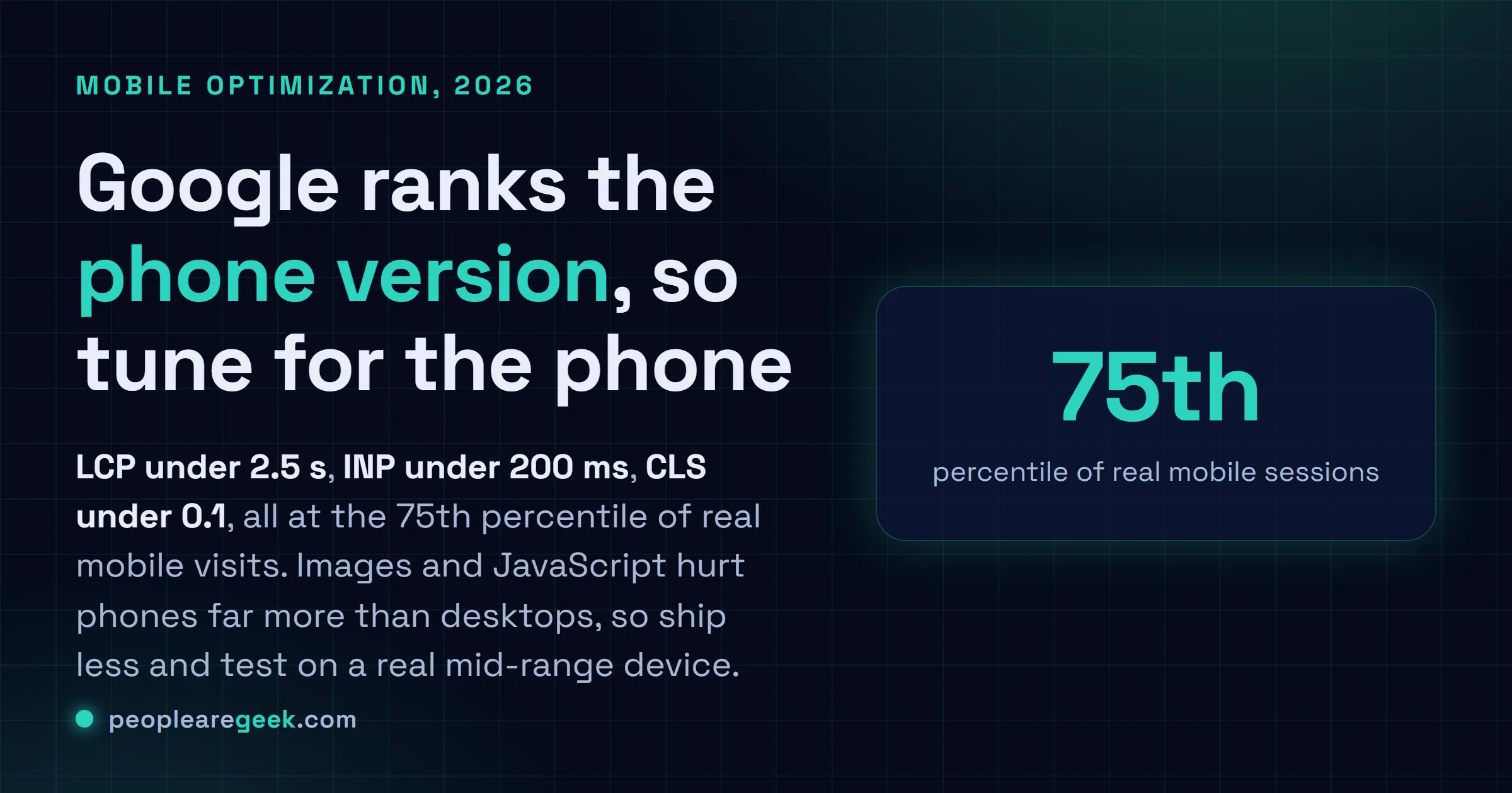
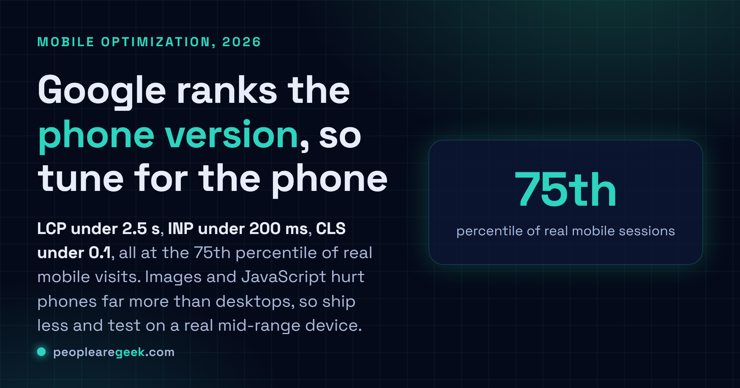
Mobile is the default Google ranks, not a variant. Three numbers decide it: LCP under 2.5s, INP under 200ms, CLS under 0.1, all at the 75th percentile of real mobile visits. Images and JavaScript are the usual culprits, and they hurt phones far more than desktops. So test like a phone (throttle CPU and network, or grab a real mid-range device), not like you.
Your visitors are on a phone. Worse network, slower chip than whatever laptop you built the thing on. And Google's been indexing the mobile version of your site first for years, so that phone experience isn't some secondary view you can patch later, it's the one deciding where you rank. Yet here we are: most sites still get tuned on a fast desktop and shipped with a shrug. That gap, that quiet little gap, is where your traffic and your conversions leak out without anyone noticing.
So this is mobile optimization in 2026, the version you can actually use. What Google measures. What really drags a phone to its knees, and the few fixes that genuinely move things. No jargon you can't do anything with.
Mobile-first is just "first" now
Google's done with the switch to mobile-first indexing. The crawler reads the mobile version of your page, and that's what decides what you rank for. Desktop isn't the reference anymore. So if some content or structured data or a batch of links lives only on desktop, well, to Google it basically doesn't exist.
Practical rule, and it's a blunt one: your mobile version has to be the whole version. Same content, same metadata, same internal links, nothing quietly dropped. "We hide that on mobile to save space" now means hiding it from search too. Honestly that's the trap I see most often.
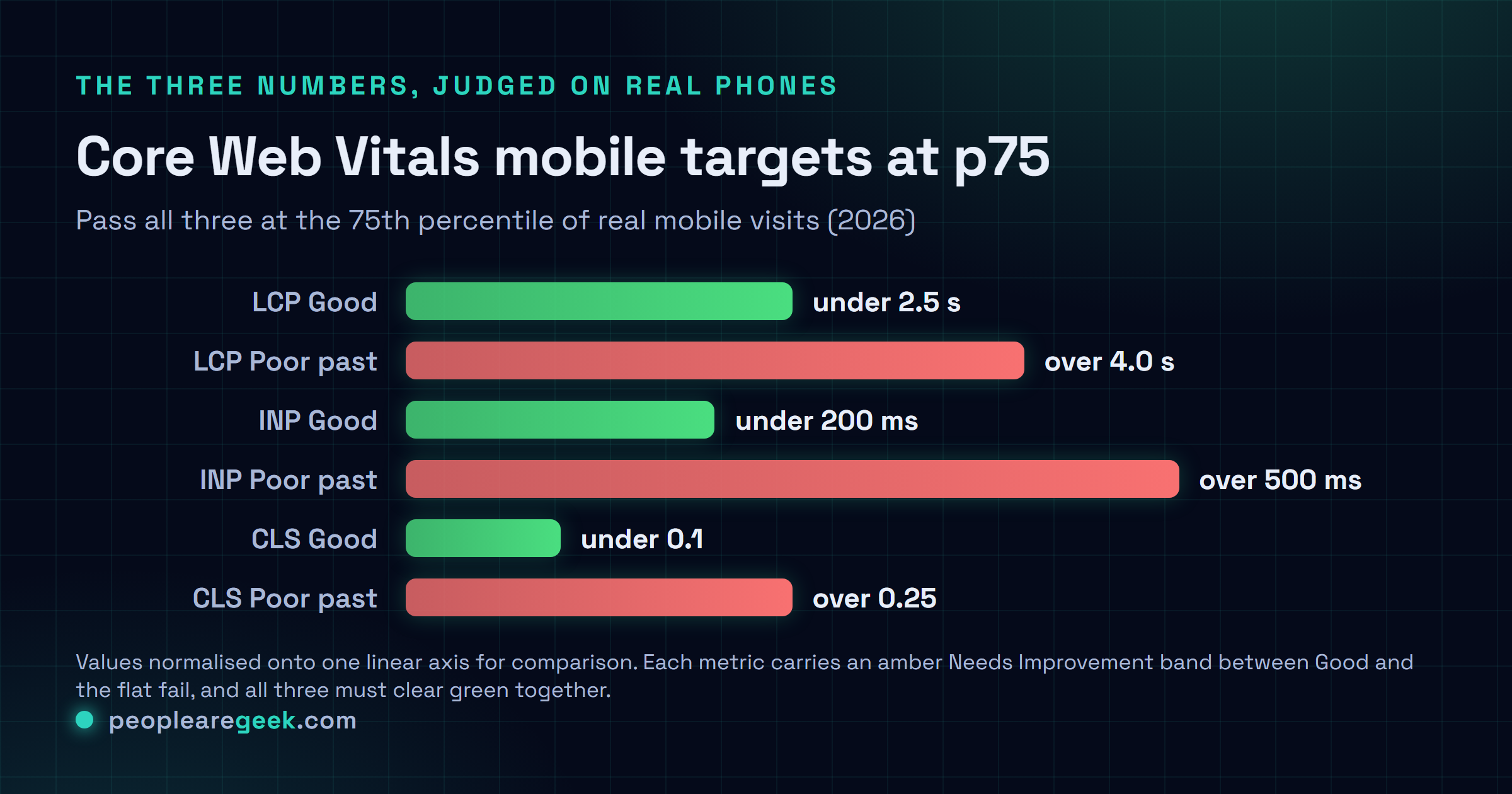
The three numbers Google measures
Core Web Vitals are the user-experience metrics Google folds into ranking. They're measured on real visits, weighted toward mobile. You've got to pass all three at the 75th percentile, which is just a fancy way of saying three out of four of your actual users should be having a decent time.
| Metric | Good | What it measures |
|---|---|---|
| LCP (Largest Contentful Paint) | under 2.5s | How fast the main content shows up |
| INP (Interaction to Next Paint) | under 200ms | How fast the page responds to taps and input |
| CLS (Cumulative Layout Shift) | under 0.1 | How much the layout jumps around while loading |
INP replaced the old FID metric back in 2024, and it's the one most sites trip over on mobile, because phone CPUs choke on heavy JavaScript. We dig into it in our INP optimization guide, and we cover the whole set over in Core Web Vitals mastery. Measure with field data. A lab score won't cut it on its own, because the lab can't see your real users' phones.

The honest target. Chase the 75th percentile of real mobile sessions, not your own device. A site that scores a clean 100 in Lighthouse on a workstation and then stutters on a three-year-old Android is failing the people who actually matter. I'd take the laggy Android result over the pretty lab number every single time.
What actually slows a phone down
The causes are boringly consistent. And they bite harder on mobile, because a phone has a weaker CPU, less memory to spare, a connection that drops out the second you walk past a thick wall.
- Oversized images. The biggest easy win on most sites, no contest. Serve modern formats, size them to the display they'll actually appear in, lazy-load anything below the fold. Our image optimization guide covers the how.
- Too much JavaScript. Every kilobyte the phone has to parse and run pushes interaction further away. Ship less. Defer what you can. And question every third-party tag like it's lying to you, because half of them are.
- Third-party scripts. Analytics, chat widgets, ad and tag managers, they stack up fast, and their performance isn't yours to control. Audit them without mercy.
- Render-blocking fonts and CSS. A custom font that holds the text hostage, or CSS that stalls the first paint, costs you LCP directly.
- No caching or compression. Brotli or gzip on text, sane cache headers on assets. Free speed you maybe just never switched on. It happens more than you'd think.
Mobile UX that Google and users both reward
Speed gets people to the page. This is the stuff that keeps them from bouncing right back off, and a lot of it doubles as accessibility.
- Tap targets. Buttons and links big enough to hit with a thumb, give or take 24 by 24 pixels with some breathing room. Cramped controls are a WCAG failure and a rage-tap generator.
- No intrusive interstitials. A full-screen popup the instant a mobile user lands? Google actively discourages it, and your visitors loathe it.
- Readable text. No tiny fonts, no pinch-to-zoom gymnastics. Set a proper viewport, base size around 16 pixels.
- Real responsive layout. Fluid. Not a fixed desktop grid crammed onto a phone and called a day. Test the awkward in-between widths, not just the two you happen to like.
How to test like a real phone
Your dev machine is the worst possible judge of mobile speed. It's fast, it's on great wifi, everything's cached. Of course it feels snappy. Force it to lie a little less.
- Throttle in DevTools. CPU on 4x or 6x slowdown, network on a slow 4G profile, then hit reload. Honestly this might be the most eye-opening five minutes you'll spend all week.
- Use a real mid-range device. Not the latest flagship, that defeats the point. A two or three year old Android tells you what most of your users are actually feeling.
- Read field data. The Chrome UX Report and Search Console hand you real-user Core Web Vitals. That's the ground truth a lab score only ever guesses at.
Sources
- web.dev: Web Vitals and the Core Web Vitals thresholds
- Google Search Central: mobile-first indexing
- web.dev: Interaction to Next Paint (INP)
Frequently asked questions
Does Google really rank the mobile version of my site?
Yep. Google moved to mobile-first indexing, so it crawls and evaluates the mobile version of your pages to decide rankings. Anything living only in the desktop layout, content, structured data, a pile of links, might just not count. So the mobile version needs to be the complete one.
What are the Core Web Vitals targets for mobile?
LCP under 2.5 seconds, INP under 200 milliseconds, CLS under 0.1, all measured at the 75th percentile of real mobile visits. Passing on your fast laptop? Doesn't count. You need three out of four real users getting a good experience on their actual phones.
What is the single biggest mobile speed win?
For most sites it's images. Serving oversized ones the phone has to download and then resize is about the most common problem there is, and the most fixable. Switch to modern formats, size to the real display, lazy-load anything below the fold. Do that before you touch anything fancier.
Why does my site feel fast to me but score badly?
Because your device is fast, your connection's good, and your assets are already cached. Real users? Slower phones, patchier networks. Throttle the CPU and network in DevTools, or just test on a mid-range Android, and the real experience shows up right away. Sometimes it's a little brutal to watch.
Is mobile optimization separate from SEO?
No, it's the same work now. Mobile speed and usability feed your ranking through Core Web Vitals and mobile-first indexing, and the fixes (fast loads, layout that reflows, controls you can tap, text you can read) serve accessibility at the same time. You do the work once and a few different audiences benefit.